Moya is a specialty coffee shop and brunch destination built around one idea: that the best part of your day should feel unhurried. Named after the Slavic word for "mine" as in, this is my place Moya was created to be a space where people slow down, stay longer, and feel at home.
From the first cup to the last bite, every detail of the Moya experience was designed to feel intentional warm without being loud, refined without being cold
We started with the brand's emotional core the feeling of owning a quiet moment in a busy day and built the entire visual system around it.
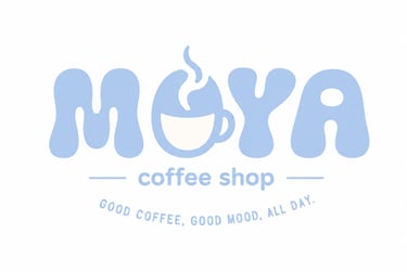
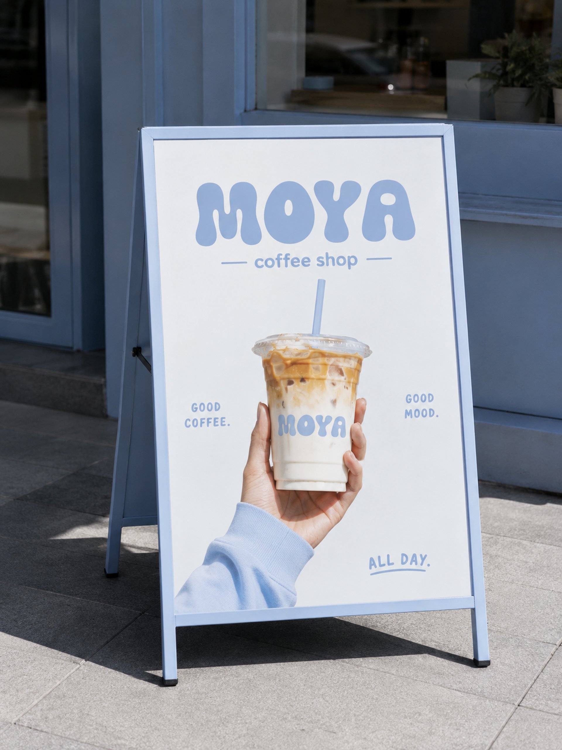
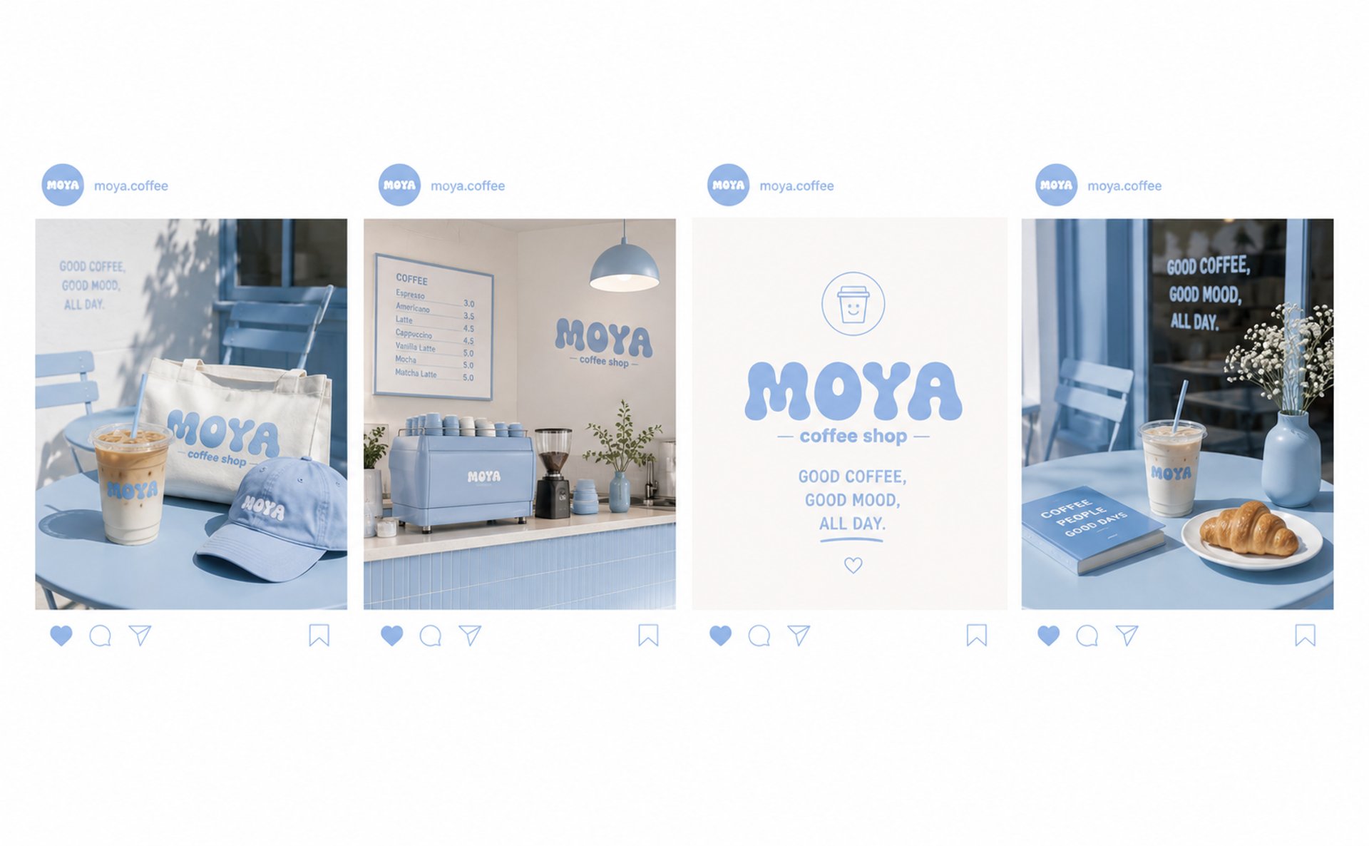
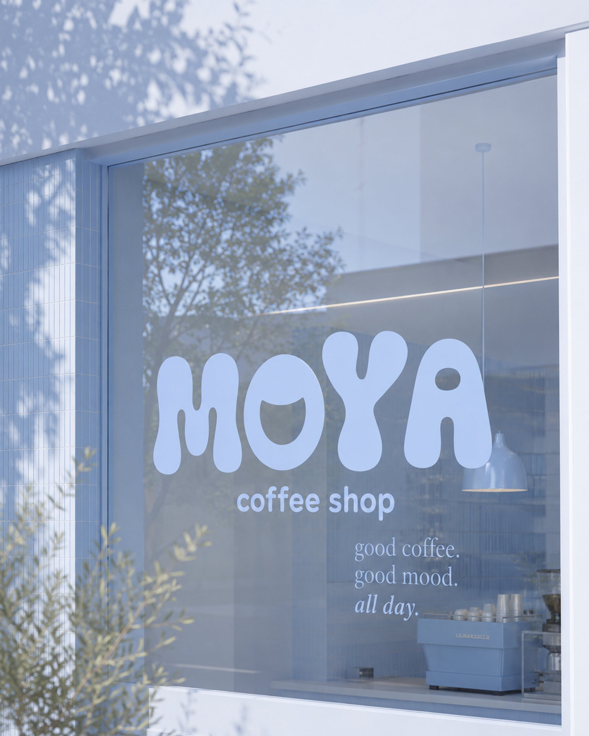
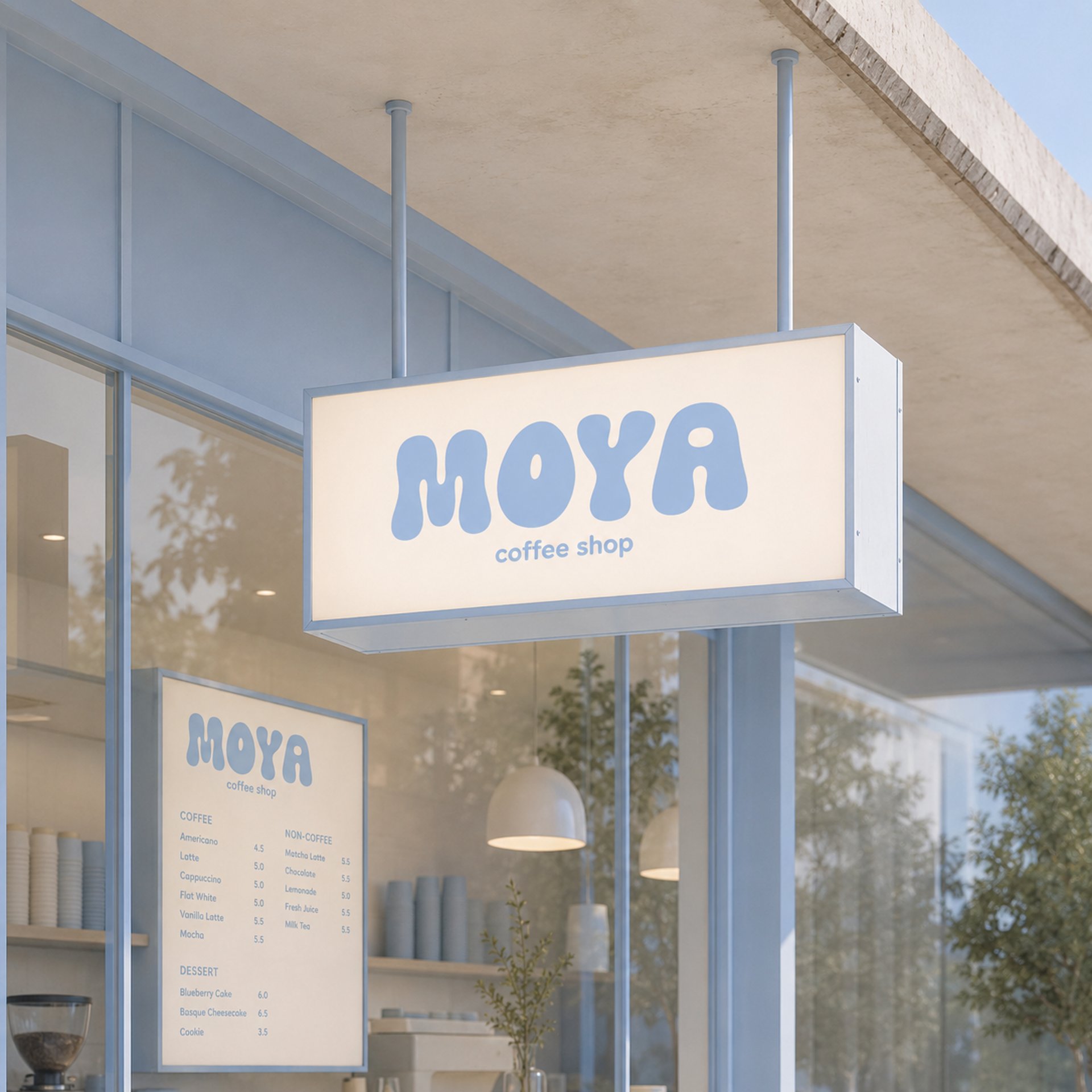
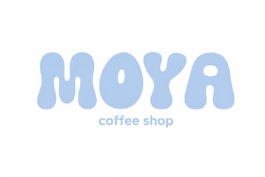
The logo draws from classic café lettering, refined into something more considered and contemporary. The color palette is anchored in deep espresso brown and warm cream, with a muted terracotta accent that nods to handmade ceramics and morning light. Typography is warm and editorial confident enough to stand on its own, soft enough to feel approachable.
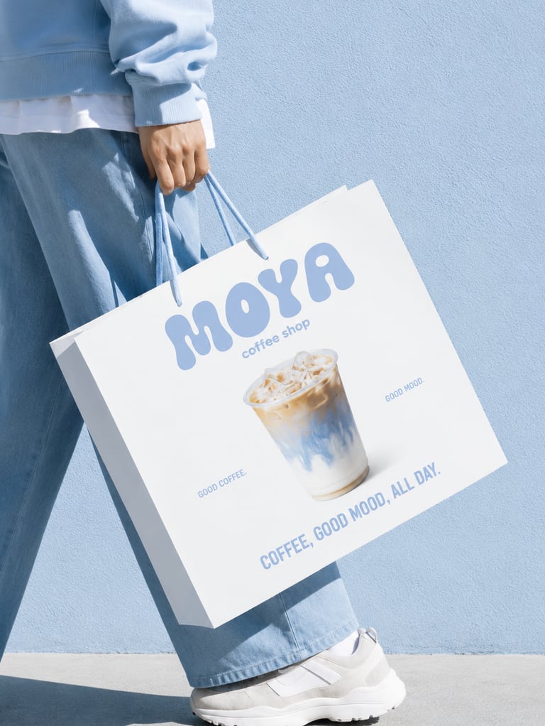
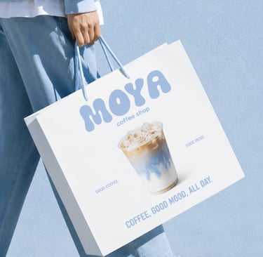
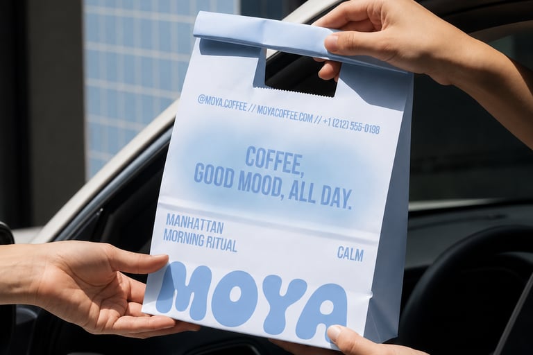
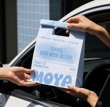
From there, we extended the identity across every surface: packaging, cups, menus, signage, and a social media system built to feel cohesive without ever looking templated.
The website was designed to give the same feeling as walking through the door warm, easy, and worth staying in.
And the result was a brand that feels like a place. Not just a coffee shop a destination people talk about, return to, and genuinely call their own.