Aelora Jewelry
Aelora didn't exist before Performa. There was no name, no logo, no color palette, no story. There was only an idea — a fine jewelry brand targeting women between 25 and 45 who value elegance over excess and meaning over trend.
That's exactly the kind of brief we build best from.
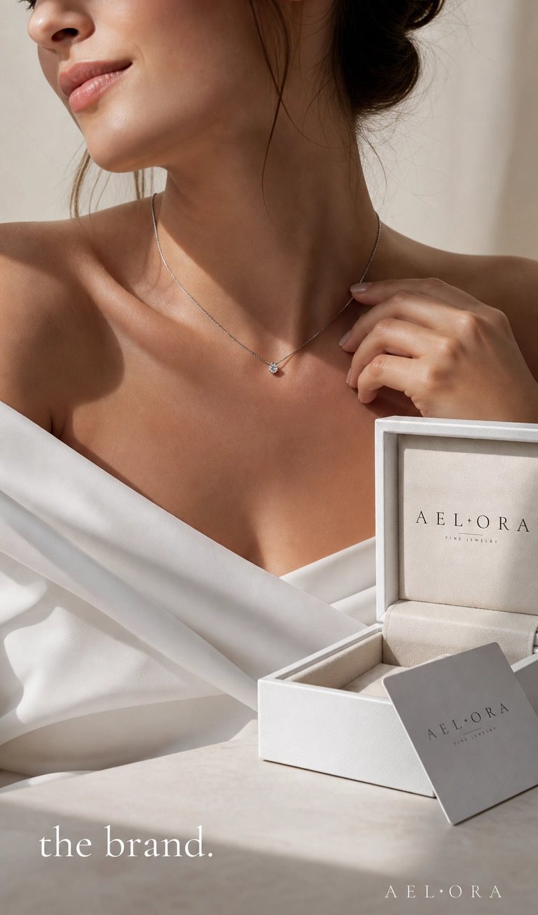
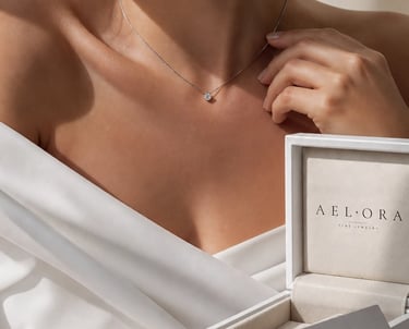
We started with the name. Aelora — feminine, fluid, and unlike anything already in the market. It sounds like something you'd whisper, which felt right for a brand built around quiet luxury.
From there we developed the complete visual identity. The logo is set in Cormorant Garamond — a serif typeface with roots in French Renaissance typography, chosen deliberately for its contrast between thick and thin strokes that mirrors the delicacy of fine jewelry itself. A single small diamond accent sits between the letters — the only decorative element in the entire identity, and the only one it needs.
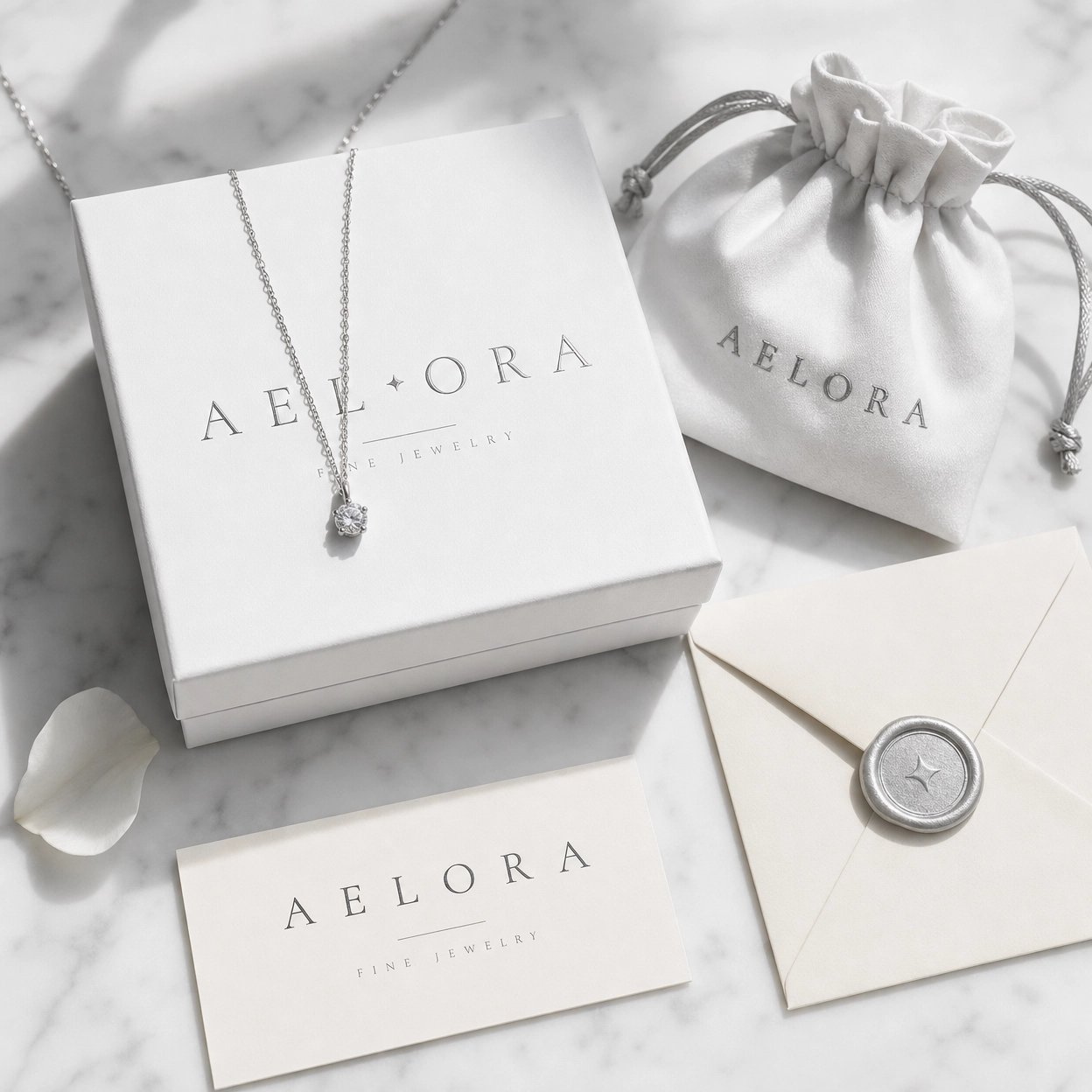
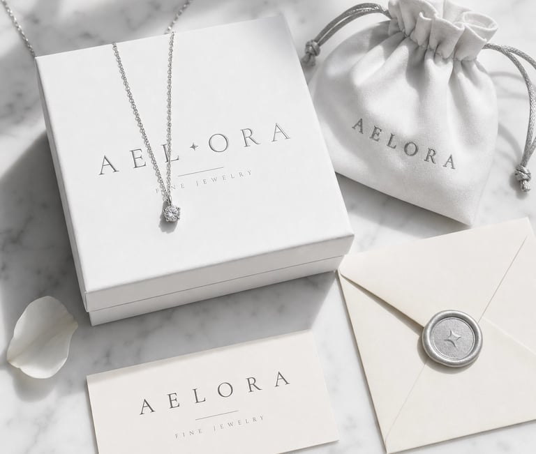
The color palette was built around restraint. Pure white, warm cream, and silver — colors that never compete with the jewelry but always elevate it. The packaging system followed the same philosophy: matte white boxes, cream silk interiors, silver embossing, and a wax seal that makes opening an Aelora package feel like an occasion.
Our mission
Our mission with Aelora was to craft a complete luxury experience that goes beyond jewelry itself. From the visual identity to the packaging and brand presence, every detail was designed to reflect craftsmanship, confidence, and quiet sophistication — helping Aelora position itself as a modern fine jewelry brand with lasting value.
Our vision
For Aelora, our vision was to build a jewelry brand that feels timeless, refined, and emotionally connected to the people who wear it. We wanted the brand to embody modern luxury through minimal elegance — creating an identity that feels delicate, sophisticated, and memorable across every touchpoint.
Strategy
For Aelora, the strategy focused on positioning the brand within the modern luxury jewelry space through simplicity, elegance, and emotional storytelling. We developed a refined visual identity built around minimal typography, soft neutral tones, and premium packaging to create a cohesive high-end experience across every customer touchpoint. The goal was to make Aelora feel timeless, feminine, and instantly recognizable in a saturated luxury market.
Alongside the branding, we designed a content and digital presence strategy centered on aspiration and sophistication. From curated product photography to editorial-style visuals and elevated social media direction, every element was crafted to build trust, exclusivity, and desire while attracting a fashion-conscious luxury audience.
Results
The final result was a polished luxury brand identity that gave Aelora a strong and credible presence from launch. The cohesive branding system elevated the perceived value of the products, creating a premium customer experience across packaging, social media, and digital platforms.
Through the refined visual direction and strategic positioning, Aelora established a recognizable aesthetic that strengthened audience engagement and brand consistency. The project successfully transformed the brand into a modern luxury jewelry label with a timeless editorial feel designed for long-term growth.